Editorial design
![]()
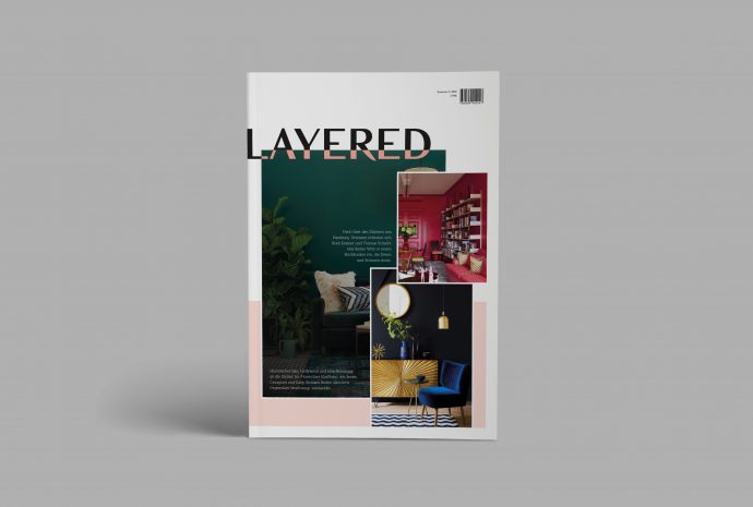
 As part of the „Editorial Design“ lecture, a magazine should be developed that corresponds to the current design guidelines. This magazine revolves around the topic of interior design. The magazine is not just limited to a specific price range of furniture, but is intended to appeal to a broad target group that is looking for inspiration and is design-oriented. The content of the magazine should be correspondingly diverse. A wide range of interior design topics will be covered. This could be, for example, do-it-yourself tips, a home story by a famous interior designer, the redesign of a hotel and much more. The design should also reflect this diversity and be adaptable to the various themes. The magazine’s name is „Layered“, meaning that something new can be created and created by overlaying and combining different elements. This process can be easily adapted to the development of interior design. The most diverse pieces of furniture, decorations and much more are combined with one another in such a way that an individual furnishing style is created. This metaphor is not only found in the name of the logo, but also the logo itself is „overlaid“ in each issue. It adapts to the respective title motif and integrates itself into it with the help of a color area, which also varies from issue to issue. This design element is not only used in the logo design, but also in the design of the magazine. The image world is also superimposed in the articles, although this arrangement is not created insignificantly, but has to match the respective content.
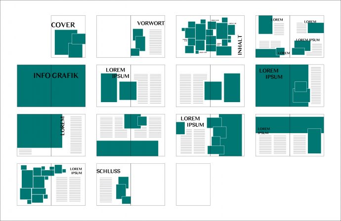
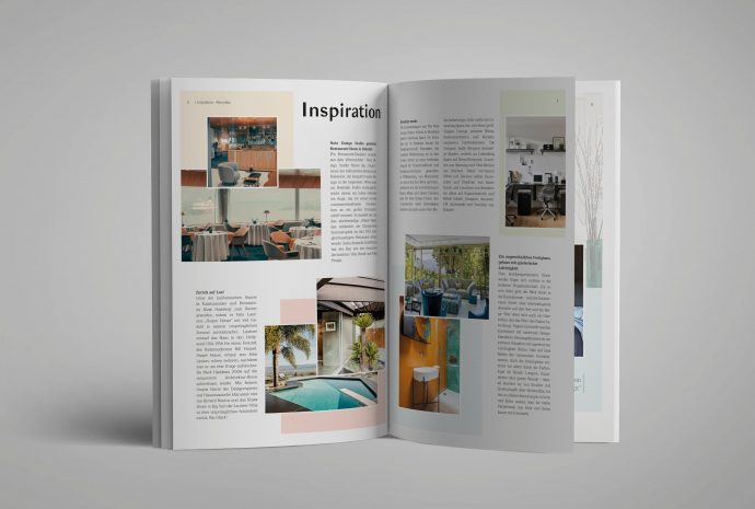
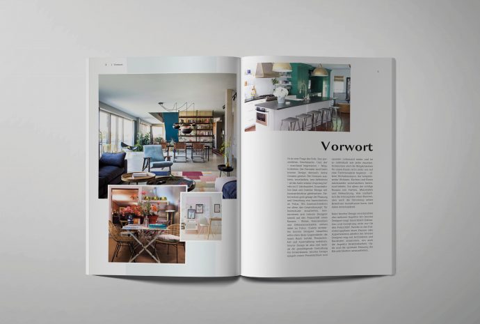
The magazine comprises 28 individual pages and the content is structured in such a way that the length of an article builds up to the title story, which is the longest article and then the article length decreases again. This should build up the arc of suspense or the dramaturgy and guide the reader. The cover and the last page together should create an image that works together as well as individually. The first and last double page of the magazine is intended to introduce and exit the reader. The introduction takes the form of a foreword, which is intended to bring the reader closer to the topic of the magazine. Finally, on the last double page, there is a series of different quotes from interior designers. These quotes are very varied and are intended to give readers food for thought or encourage them to continue to engage with the topic after reading the magazine. The table of contents of the magazine should resemble a mood board, since the reader should not be able to read it linearly, but look at the imagery and only then be able to find their way around and recognize the individual articles. The imagery of the table of contents gives a preview of the contents of the magazine in order to increase the reader’s curiosity and interest. In order to further develop the interest of the reader, there are several small articles on the next double page that report on current affairs or reader contributions. Short texts and meaningful images introduce the articles without claiming the viewer’s attention at the beginning with articles that are too long. Now the first detailed article begins, which deals with the furnishing of attic rooms. After the first page takes a general look at the topic and underpins it with a quote, the second double page of the article goes into the various possibilities in a more targeted manner. The article is supported by various and varied images, which are intended to bring the reader closer to the topic both in terms of content and visually.
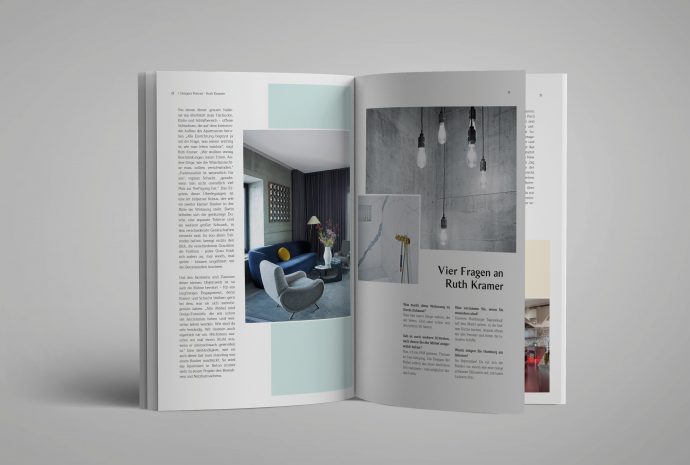
Now comes the most important article of the magazine, the cover story. With a length of three double pages, this is examined in detail. This issue features a designer who transformed a former bunker into a designer apartment without neglecting the bunker’s characteristics. In addition to a detailed article about the designer and her furnishing style, a quote and many pictorial impressions, there is also a small interview at the end of the article in which four questions were asked of the designer. The title story is followed by an article that extends over two double pages. This is about a home story by another designer, who offers a contrast to the previous article in terms of the design of the facility, so that the content is varied and different tastes of the readers are addressed. Here, too, the size of the title picture adapts to the length of the article; in contrast to the full-size title picture of the title story, the article is presented on a single page. In terms of content, a quote from the designer is also highlighted here in addition to the actual article. The last article is again limited to a double page and describes the design and interior design of a pop-up store. In addition to a short text, this article also contains a quote and a description of the title, which quickly and clearly introduce the reader to the topic in each article.