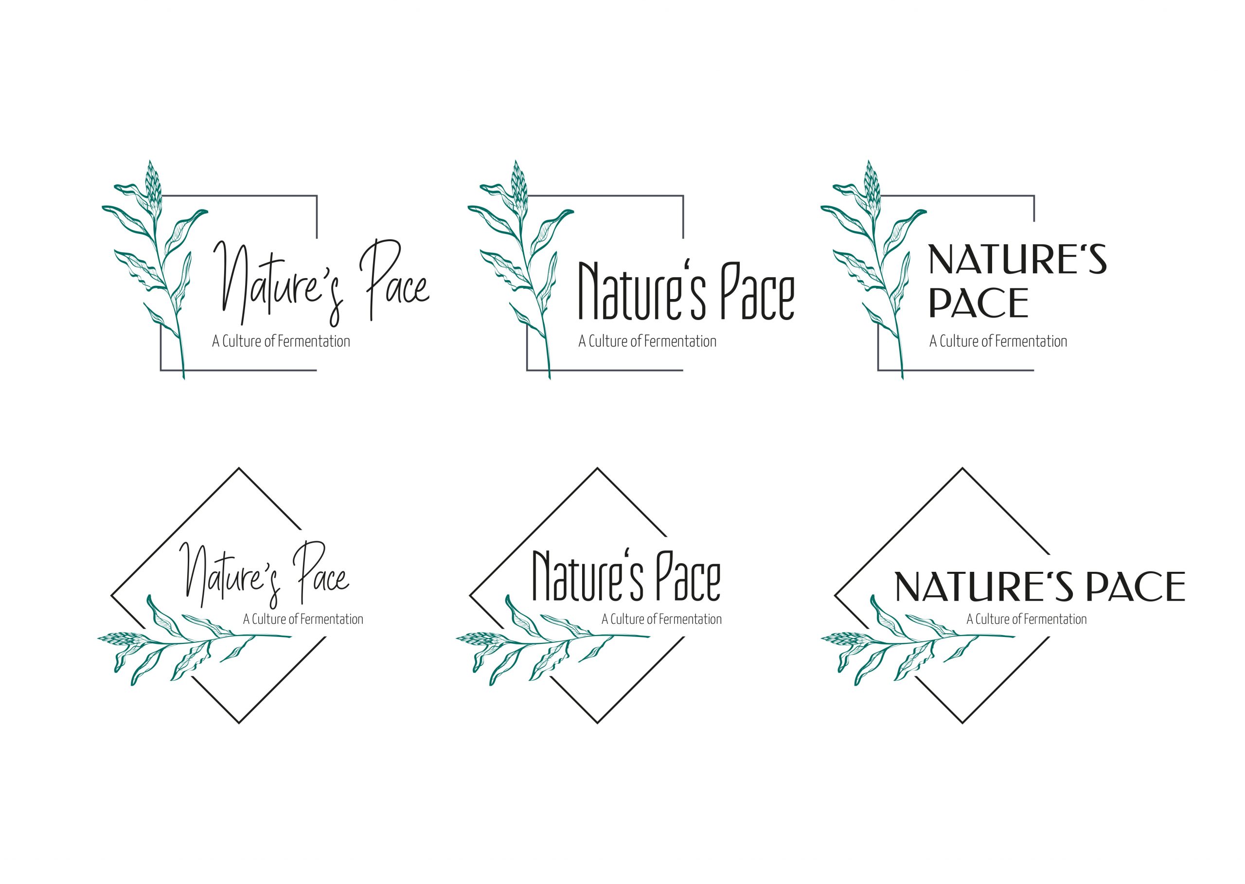
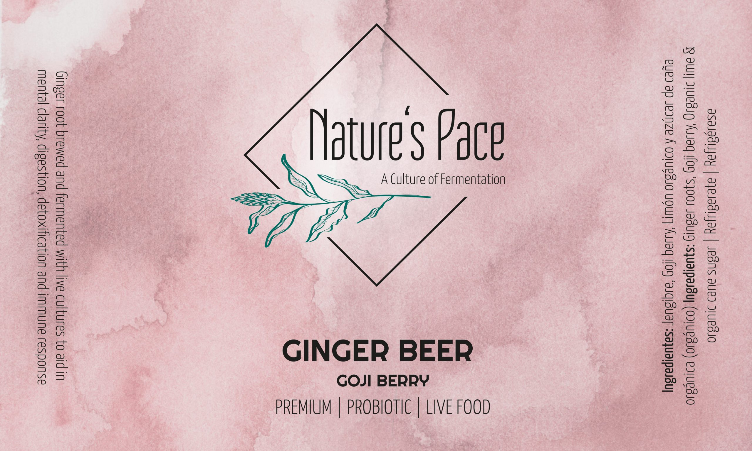
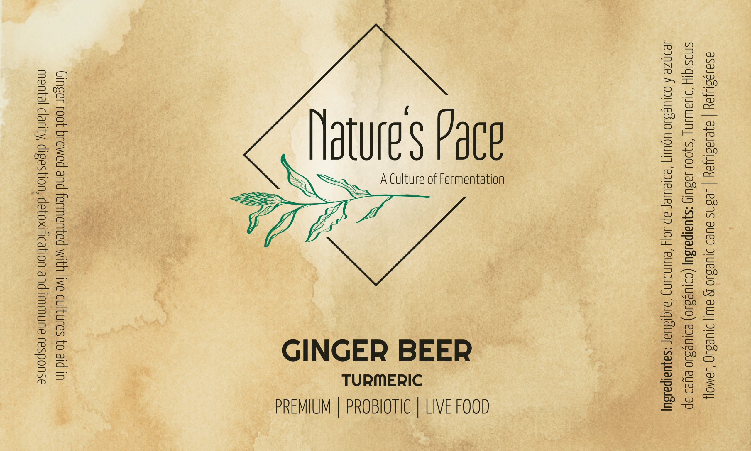
Logo development
The logo was redesigned for this project. In order to take up the manufacturing process as well as in the name, the graphic element in the logo represents an illustrated ginger plant. In addition, different fonts and arrangements of the elements of the logo were tried out. The final design was ultimately chosen because it best expressed the impact on the label. The font of the logo is Tulip One, a tall and narrowly set sans serif designed for use in headlines, for example.